Danfors Fastighetsförmedling
UI Design & Code
17/10 - 2017
1. Introduction & brief
I was approached by Håkan, the owner, after he had seen my previous work. He wanted to make his current website mobile friendly to gain more visitors to the website. After a brief discussion we came to the conclusion that a complete redesign of the website and system were in order for them to be able to produce good and engaging material for their visitors. This meant producing the website in Wordpress as his workers in marketing was familiar with the system and I was experienced developing for it. This meant to be able to dynamically load the objects(houses, etc) into a custom post. Other important notes was that he wished to keep his knowledge bank and have a 'blog' section. I knew that this material could prove to be rather useful to keep the visitor engaged as they could act as CTA(Call to actions) and keep the user on the website. We talked about me examining the market and see what the top firms are doing and how that may apply to what we wanted to do.
Original Danfors site, very 2002ish..
2. Research & Sketching
Straight away I started analysing our meeting and what the important bits where. I started organising the different thoughts and ideas and how they could relate to each other, how they could improve the situation and solve their current problems. These problems were stated at the meeting and some important notes to take into consideration:
- Not gaining enough visitor to the website. No notes ->(No actual knowledge of whats going on)
- Lack of visual aesthetic and not relating to current visual guidelines
- No ability to easily share to social media
- With the redesign, give my inputs on what to improve in their guidelines and marketing
2.1 Navigation patterns at competitors
Examining patterns
Examining patterns
When researching I had some specific notes that I wanted to explore prior to wireframing and creating any layout. I wanted to see the patterns of data structuring and navigation. Since the website is very content driven with a lot of material it had to make sense UX wise. So, naturally I went and tested the user experience and I also asked others how they experienced websites. The people interviewed were family and friends which recently bought houses and apartments. Some of these questions were:
- Did any of these websites stand out to you while browsing? If so, why?
- Which sites did you tend to visit when in search of house?
- When navigating the sites, do you tend to rely on search or just browsing?
- Is there anything in the process of buying a house that intimidates you? If so, why?
These types of questions generated some great data for me to dig into. Often the interviewees tended to rely on browsing with the help of some minor filtering. They often used to want to quickly head for the "for sale" tab as they are not often interested in anything else.
Mostly they visited hemnet which is Swedens largest realtor website which gathers all the houses etc. However, some realtors were so good they use to go them first. Simply just because of the quality.
Most of the older people asked said that they were not intimidated by the process of buying anything since they have done it before. As Håkan has stated before, he wanted to reach out to young people and deliver the sensation of service in each and every step. When asking the younger people interviewed they said that they were, in fact, intimidated by the process and felt that it was an enourmous when buying an apartment/house.
2.2 Mapping what's important
After these interviews I found it important to map what this all meant and how it would relate to the website. After a good session of mapping with post-it notes I wrote down the important bits that graphically the website should represent.
Important words that I wanted the design should embrace and put out were "Swedish", "traditional", "locally", "personal".
What did these words mean then? As Håkan said earlier, the company aims to be of most service through all the steps and go out of their way to ensure that the customer feels comfortable. The company also wanted to ensure that their current visual guidelines should be updated but be followed to be able to be recognized.
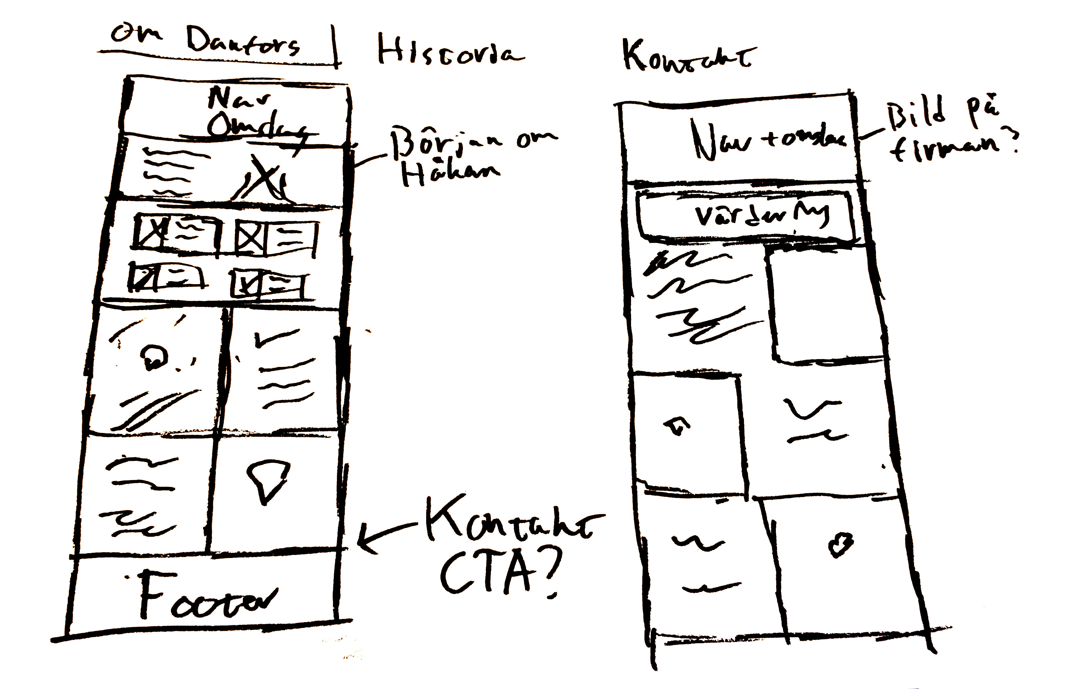
3. Wireframing
Lägg till från stora sketchblocket
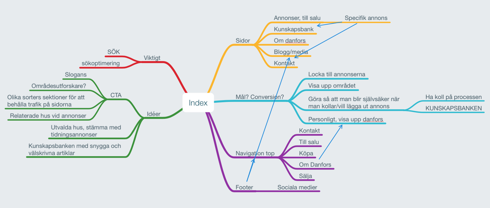
Flowchart and navigation pattern
Wireframing
The wireframes were produced with the help of the data from interviews and other visual patterns. I knew that I wanted to create a set of different CTA sections instead of the trending popup modals. I think that a modal is terrible UX when wanting to push campaigns to customer. They are great when supporting data such as contact forms but when wanting the users know that they will get a free valuation of houses I want to rely on a better layout and let the users know without thinking about it. Other ways than sections was also added that will be shown later. They were not sketched out in the wireframing sessions as they were done in the production phase.
Multiple wireframing
Ad wireframe
4. Visualizing colors
Old visual guidelines & branding
The old guidelines felt a bit outdated and I analysed current visual trends and how they could be developed in the future.
The typography was already great as they used Avenir and was a great choice for their website. It is a font that is very much aligned to them and how the users recognize the company in ads etc.
The colors was something I also would like to keep but just bring up to current standards. Adding gradients was something that modernised the guidelines and different shades(ÄNDRA ORD till nyanser).
Testing color combos with old visual guidelines
I wanted to bring out the west coast of Sweden a bit more. The region of Laholm where Danfors is located uses green, blue and yellow a lot to mirror our great nature, ocean and beaches. This is something I also would like to use to mirror the feeling of moving here to people not from the west coast.
5. Sketching and prototyping
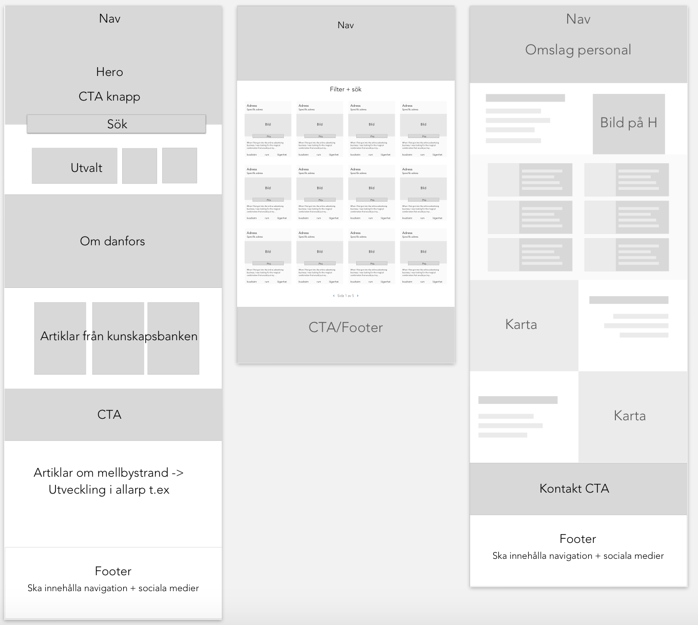
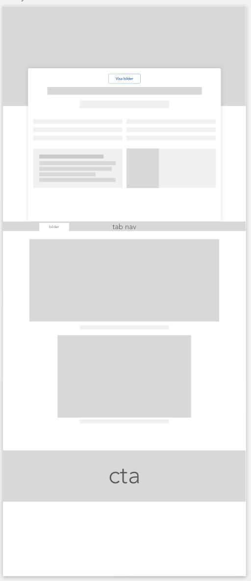
Putting colors to the wireframes is a big step. This is where you start to see the fruit of all that hard research labour. A previously stated. These sketches represent functionality gathered from interviews, wishes and mapped data. The landing page gives a clean and easy way to continue the journey down the website. Often people just want to go to browsing houses. To answer to this the quicksearch is among the first things you see. When searching it takes you to the "for sale" page where you can browse objects.
If you want to continue watching the website the section of featured houses comes next. This is a way for Danfors to be able to offer to it's clients a spot on the front page or bring houses which has been on the market for a while into the spotlight.
Next section is for the user to get to know the company and its people.
The next section is the knowledge archives where there are articles describing different processes in buying something. These are used throughout the website to quickly access and read. They are a part of the CTAs created.
CTA section for contacting Danfors. 3 different made to show up on the website where it is appropiate.
What is going on on the west coast. This is the 'blog' part where Danfors can update it's visitors on its recent news.
The footer consists of latest objects, posts and the availability to sign up to Danfors newsletter where they send out featured/latest listings.
First sketch of website
The rest of the sketches are posted below. The sketches serves as guidelines when coding and may change during the process of developing.
About Danfors
Contact page
6. Development
This is where the advanced stuff happens. If you are not interested in technical bits, skip this part and go to the next section to see final results.
The customer wanted Wordpress to be their CMS to be able to work with the page. Wordpress is a great choice, especially when you get to create the theme from the ground up and you can control which plugins are installed and what frameworks to be installed.
I started out coding the static site just to get some coding done. As I knew the website would be complex with a lot of content I decided to use some Bootstrap components, simply because some of the components are great and no need to reinvent the wheel. The gridsystem was used in the start but I grew frustrated by it and went over to Flexbox.
After the front page was a static site I started converting it to a wordpress theme. I used underscore as a base to take care of known wordpress issues etc. On top of it I used Sass as a CSS compiler to keep myself sane during the process. Jquery was used for simple stuff as sliders and some JS hacking for the navigation. Plugins used to make the functionality work was:
- Advanced custom fields
- Custom post UI
- Responsive-lightbox
- search-filter-pro (To search throud custom posts and other functionality)
- wp-all-import-pro (To import from other databases and use the server to download info)
The most advanced amongst all was the data import. After coding the functionality of download each and every piece of information and placing it in the right fields Danfors decided to change its supplier of software. This challenged things massively for me since the new suppliers required much more safety to access the data. This data was also just a list with IDs of the objects which were needed when accessing more data in other lists which made things very complex.
7.1 Behaviour of sections
Navigation bar
The navigation bar had to switch from it transparent background to something of color. This happens with an offset of pixels where it knows when to switch.
Call to actions
CTAs is something as previously stated used throughout the page. I wanted to create one that pops up automatically without disturbing the users experience. As the nav executes after X pixels, this works the same.
Ease scroll to top
A back button is something that is a must on content heavy sites. The user grows tired of scrolling and wants an easy way of accessing navigation. This can be altered in the future to further enhance the experience.
Mobile version navbar
As I have experimented with lots of cool concept navbars before, this time I went for the Bootstrap version because of limited time and to support all browser. This webpage does have to support at least IE 11+ which holds me back while developing.
Search
The search function is altered in order to search the Advanced custom fields on the website. It also uses AJAX to search which means that no need for the page to reload which in turn gives a more seamless interaction.
7. Results this far & Reflections
The site is live and active over at Danfors.se. Go have a look!